FPYC Brand
At some point we should do a deep dive on where we got our Camp logo. Must be a cool story there somewhere. Regardless, as we pass the 50th year of camping at FPYC, we’re brushing things up a bit. Find below usable artwork and formal color pallet information. Use to promote camp, represent us well.
If you need to create super large presentations of any of these, please reach out for vector graphic files which can be scaled to larger sizes without becoming fuzzy.
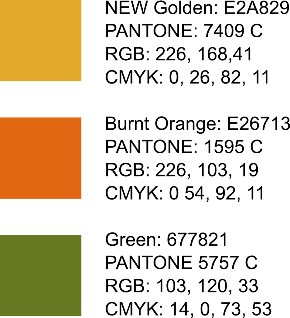
The font is Palatino Linotype, and the color pallet is as follows:
FPYC 1
Consider this our standard logo. Other layouts are offered to suit specific space constraints. On primarily dark or bright backgrounds, this should be the default.
FPYC 2
Useful when vertical space is limited, but room to feature the logo plate.
FPYC 3
Useful when filling horizontal space and putting added emphasis on the camp name.


FPYC 4
Useful when horizontal space is limited, but full camp name is wanted.
FPYC 5
Useful to feature the logo plate when full camp name isn’t needed.
FPYC 6
Useful for a more vertical stacking when full camp name isn’t needed.
FPYC Badging
Useful for application on busy or uneven backgrounds.
FPYC Outlines
These are bitmaps, not to be mistaken for vector line artwork.
Didn’t see what you need? Reach out and we’ll be glad to help with FPYC Brand artwork.
